
DE
EN
Bárbara Tamilin on her packaging illustrations for Nestlé Moça
 Part 2: Written by Garrick Webster
The Brazilian illustrator Bárbara Tamilin recently created five unique packaging illustrations that celebrate Nestlé’s Moça dessert brand – a favourite for over 100 years throughout her country. With an aesthetic evoking the comforts of home and motifs to chime with the national culture, the beautiful series of collectible cans has consumers loving the packaging just as much as they love the desserts inside.
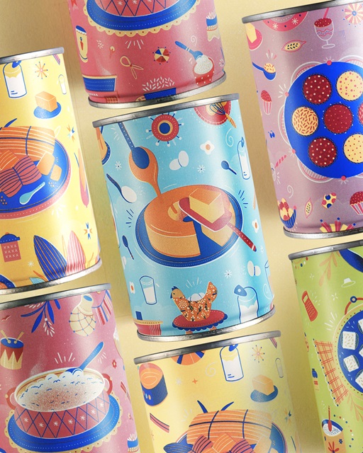
Part 2: Written by Garrick Webster
The Brazilian illustrator Bárbara Tamilin recently created five unique packaging illustrations that celebrate Nestlé’s Moça dessert brand – a favourite for over 100 years throughout her country. With an aesthetic evoking the comforts of home and motifs to chime with the national culture, the beautiful series of collectible cans has consumers loving the packaging just as much as they love the desserts inside.
In the following Q&A, Bárbara explains how the brief came about, the five illustrations she crafted, her creative process and what the project has meant to her.
When and how did the job come about? In the middle of 2020, during the COVID pandemic, my agent at IllustrationX, Ana Bandarra contacted me to see if I would be interested in creating some artworks for the FutureBrand agency and its client Nestlé. The creative team had already seen my work and decided my style was a good match. What was the brief? I was commissioned to create illustrations based on some of the most famous dessert recipes here in Brazil – pamonha, brigadeiro, rice pudding, pudding and cocada. The images had to contain ingredients from the recipes and elements from Brazilian culture. I worked directly with Nestlé and FutureBrand on the project. What did this opportunity mean to you? This is certainly the biggest job I've done in terms of national visibility. I was really happy to receive the brief and working on Moça brought back many childhood memories. How did you approach the artwork? I wanted the illustrations to be easily recognisable to consumers, with light, smooth colours and a nostalgic aesthetic. It was also important to me that the five cans could sit together and create a beautiful combination that showcases Brazilian cuisine. The colour palette was already being used for Nestlé Moça products and I had a strong and consolidated brand guide to follow. When creating the image for each can, it was important that they should talk to each other and make sense as a whole, while not deviating from the Moça brand aesthetic. As for the individual recipes, I was careful to include necessary ingredients throughout the designs, even if they were smaller or just decorative. What media did you use? I worked on the drafts and final files digitally, switching between Procreate on the iPad and Photoshop on the computer. Some of the elements I painted manually with a brush and scanned in to ground the textures in the real world. What feedback and amends did you receive during the process? Just a few quick colour adjustments and making sure the dessert images were in a consistent location across illustrations so that they would work harmoniously together. What regional and cultural aspects did you include in the illustrations? Important elements in the illustrations are references to popular street parties in Brazil such as the São João Festival and Rio de Janiero’s Carnival, where puddings like these are consumed. I wanted to bring in aspects of our music, popular culture, architecture, clothing, fruit and more. Which details appealed to you personally? I really enjoyed drawing core elements of Brazilian cuisine such as chicken eggs, blenders, wooden spoons and the clay water filter. They reminded me of my childhood kitchen. The fact that I love all the recipes so much made me super happy! What has the feedback been like? I’ve received many compliments and I’ve been very happy with the feedback. I’ve been invited to talk about the packaging on pod casts and the work has been entered into the ABRE Awards here in Brazil. What’s it like to see the packaging in retail? It’s cool to see my work on the shelves. Moça condensed milk is found in many places, so it’s impossible not to see it in supermarkets, bakeries and pastry shops. I’m receiving photos from friends who find it on the shelves. The desserts have been well-publicised and the cans are collectible. People are using them as flowerpots and pencil holders. What’s next for Bárbara Tamilin? Just continue illustrating beautiful products around the world. Read part 1 of this feature here.