
DE
EN
Illustrated map specialist Claire Rollet brings a human touch to The 1960s in Maps by Granta Books.
 Having achieved great success with the Brilliant Maps books – with their infographic style presentation – Granta Books decided to create a book mapping the social history of the 1960s. This called for a different approach, one where the narrative and human aspects for each map would be just as important as presenting the facts and figures.
To achieve this, the publishing team relied on Brighton-based illustrator Claire Rollet. This is what she told us about the project.
Having achieved great success with the Brilliant Maps books – with their infographic style presentation – Granta Books decided to create a book mapping the social history of the 1960s. This called for a different approach, one where the narrative and human aspects for each map would be just as important as presenting the facts and figures.
To achieve this, the publishing team relied on Brighton-based illustrator Claire Rollet. This is what she told us about the project.
How did The 1960s in Maps project come about?
Granta got in touch wanting to create a new book of maps following the success of their Brilliant Maps series – this time dedicated solely to the 1960s. They loved the maps in my portfolio and thought my style of work would fit particularly well in illustrating this eventful decade.
What was your initial brief?
My brief was to design 100 maps to illustrate the facts and events researched by the author,
Gordon Kerr.
How did you develop the style and refine the process to create so many illustrations?
For such a large project, I needed to work out a methodical process from the get-go. For each map, Gordon would send me a spreadsheet with the numbers, facts and text, and told me whether it was going to be single- or double-page spread. First and foremost, I had to bring out the essence of each map so that it would be obvious at first glance – that is the role the illustrations play. Then, working with the type, I worked out how to include the further information for each point made. There is a huge amount of data so often it was a difficult puzzle to crack but I absolutely loved the challenge!
How did visual references come into play?
To understand the essence of each map, I researched the key events that took place. For Troubled Waters, for instance, the map is about catastrophic oil spills so dark purple dominates the map and black ink spills all over the spread. Just like sticky oil, it goes everywhere we have the labels and the main text box in black oil colour too. The bright yellow figures clearing up the mess refer specifically to one of the disasters. What was your approach to the colour palettes in the book?
Bright, fun, poppy colours are associated with the spirit of the decade, so I used them together with the theme of the map to convey the atmosphere of the subject. For example, the map Whaam! Blam! Pow! is about the art movements of the 60s so I used primary colours and a dotted background in reference to Roy Lichtenstein, a prominent artist in the Pop Art movement. This was all tied in beautifully together thanks to designer Nikki Ellis, who ensured the book was cohesive using colour blocks behind the main text and chapter openers, fonts and the cover. 100 maps is a lot. How did you manage?
It is a lot, but that made it all the more exciting. Making a book involves quite a few people and everyone has their own specific task to get on with. We had with us Granta’s editorial director, Laura Barber, overseeing the whole process and keeping us true to the vision for the book. Teamwork was important, and everyone involved was reliable and flexible and so nice to work with, making the process a real pleasure.
What were some of the most challenging maps to depict?
Mainly the trickiest part was to organise the data in the clearest, most straight forward and concise manner, with the map being the central part of the spread while course keeping the gutter clear because nothing can be read where the two pages meet. I revised a few of the maps a few times until I got them just right. For The Globe-trotting Monarch, for example, I started by colour coding the years and countries Queen Elizabeth II visited but I felt the map was really confusing especially as the Queen visited some countries several times across the decade. The Your Majesty! map was also tricky as I was trying to organise the data in three different maps representing each monarchy. I was worried some of the locations were so small we would not be able to see them. In the end one world map and a zoom-in box did it, thanks to designer Nikki’s suggestion.
Which ones are your favourites?
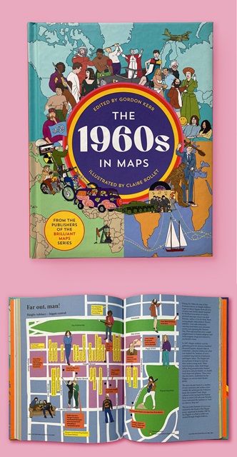
I love how La Grande Boucle turned out. It’s a map about the Tour de France and seeing the 10 routes wriggling around France – because they change the course every year – looks like veins flowing through the country, which I think is quite fitting. Far out, man! is also really fun. It’s one of the most zoomed-in maps, covering the Haight-Ashbury area of San Francisco. The streets being in grid-like formation gives a great visual effect and packed with fun facts. I also really like Code Red! It reminds me of spending many hours reading the worst disasters pages in The Guiness Book of Records and loving it!
What software and/or media did you use?
I use Photoshop as I want my illustrations to retain their hand-drawn quality.
What has the feedback been like? So far, I’ve seen people who experienced the 1960s and who would not look at illustrated books normally, take real interest in revisiting this tumultuous decade. Early teens are interested looking into the facts the book presents as they might be touching on those subjects and themes at school. It’s great that the book has a very wide range of themes from music to cinema to political conflicts to sport. There’s something in it for everyone and because of the book’s visual qualities, even serious and complex events are digestible.
What has it meant to you personally?
I love it! I’m very proud to have done a good job on it, I think it works. Time will tell; the book now has a life of its own. It was a big project, we worked on it for a couple of years, but by the end the working process was like a well-oiled machine going at full speed. So next time will be super-fast from start to finish! Read more on the project here.