
DE
EN
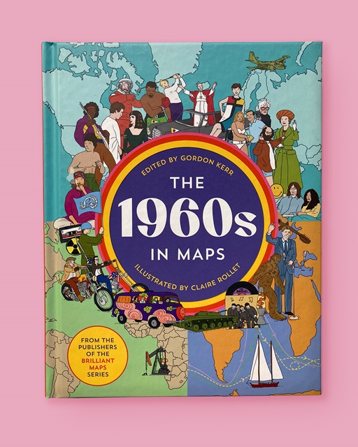
InsideOut: Illustrator Claire Rollet brings The 1960s in Maps into the groove for Granta Books
 Words by Garrick Webster
The Brilliant Maps books are… well… just brilliant. That infographic aesthetic, using playful vectors to convey lots of data about people and places around the world chines perfectly with the information age. It’s hit the sweet spot when it comes to readers’ expectations, and each edition has been a hit for Granta Books.
But there are lots of ways in which maps catch the imagination, and sometimes a different look and feel is called for. With The 1960s in Maps, Granta has embraced a more narrative-led approach using hand-drawn artwork to suit the era. While Brilliant Maps are brilliant, this one’s… far out!
“Rather than simply give readers facts and data, we wanted the maps to tell the story of the decade, to evoke the mood and atmosphere of the times, to capture the spirit of its distinctive culture,” says Laura Barber, the associate publishing director at Granta who led the project.
“To achieve this, we needed to find an illustrator with a strong sense of narrative and personality, and Claire Rollet was perfect,” she adds.
For Claire, the brief was a little bit daunting – to create 100 maps illustrating how the world changed socially, culturally and politically during the 1960s using facts and events researched by author Gordon Kerr. Big commissions like this are always exciting for an illustrator, but a methodical approach was required both to meet deadlines and to ensure a quality outcome.
“We began with a few initial examples to set up a process, and after that things went really smoothly and fast,” explains Claire. “Gordon would send me a folder for each map with a spreadsheet full of numbers and facts, the text and some visual reference material. I would then create the map as you’d see it now in the book, with the fact labels, colours and illustrations.”
The human touch
Claire has given the book its charm by drawing each illustration by hand, then applying the colours and finish in Photoshop – a human touch for stories that are essentially about people.
Project manager Nikki Ellis ensured a coherent design aesthetic was applied throughout the book, and the entire process was directed by Laura Barber. “Teamwork was key, and it was great that everyone involved was reliable, flexible and nice to work with, making the process a real pleasure,” says Claire.
Civil rights, popular culture, ecological awareness, even Queen Elizabeth II’s global superstar status – each map had a specific theme and essence to it, which Claire needed to evoke visually. Furthermore, the imagery needed to connect to the 1960s while still scanning well with contemporary audiences.
“The difficult thing was to organise the data in the clearest, most straight forward and concise manner, with the map being the central part of the spread while keeping the gutter clear because nothing can be read where the two pages meet. I revised a few of the maps a few times until I got them just right,” says Claire.
“The Your Majesty! map was tricky as I was trying to organise the data in three different maps representing each of the monarchies. I was worried some of the locations were so small we would not be able to see them. In the end one world map and a zoom-in box did it, thanks to designer Nikki’s suggestion,” Claire continues.
Words by Garrick Webster
The Brilliant Maps books are… well… just brilliant. That infographic aesthetic, using playful vectors to convey lots of data about people and places around the world chines perfectly with the information age. It’s hit the sweet spot when it comes to readers’ expectations, and each edition has been a hit for Granta Books.
But there are lots of ways in which maps catch the imagination, and sometimes a different look and feel is called for. With The 1960s in Maps, Granta has embraced a more narrative-led approach using hand-drawn artwork to suit the era. While Brilliant Maps are brilliant, this one’s… far out!
“Rather than simply give readers facts and data, we wanted the maps to tell the story of the decade, to evoke the mood and atmosphere of the times, to capture the spirit of its distinctive culture,” says Laura Barber, the associate publishing director at Granta who led the project.
“To achieve this, we needed to find an illustrator with a strong sense of narrative and personality, and Claire Rollet was perfect,” she adds.
For Claire, the brief was a little bit daunting – to create 100 maps illustrating how the world changed socially, culturally and politically during the 1960s using facts and events researched by author Gordon Kerr. Big commissions like this are always exciting for an illustrator, but a methodical approach was required both to meet deadlines and to ensure a quality outcome.
“We began with a few initial examples to set up a process, and after that things went really smoothly and fast,” explains Claire. “Gordon would send me a folder for each map with a spreadsheet full of numbers and facts, the text and some visual reference material. I would then create the map as you’d see it now in the book, with the fact labels, colours and illustrations.”
The human touch
Claire has given the book its charm by drawing each illustration by hand, then applying the colours and finish in Photoshop – a human touch for stories that are essentially about people.
Project manager Nikki Ellis ensured a coherent design aesthetic was applied throughout the book, and the entire process was directed by Laura Barber. “Teamwork was key, and it was great that everyone involved was reliable, flexible and nice to work with, making the process a real pleasure,” says Claire.
Civil rights, popular culture, ecological awareness, even Queen Elizabeth II’s global superstar status – each map had a specific theme and essence to it, which Claire needed to evoke visually. Furthermore, the imagery needed to connect to the 1960s while still scanning well with contemporary audiences.
“The difficult thing was to organise the data in the clearest, most straight forward and concise manner, with the map being the central part of the spread while keeping the gutter clear because nothing can be read where the two pages meet. I revised a few of the maps a few times until I got them just right,” says Claire.
“The Your Majesty! map was tricky as I was trying to organise the data in three different maps representing each of the monarchies. I was worried some of the locations were so small we would not be able to see them. In the end one world map and a zoom-in box did it, thanks to designer Nikki’s suggestion,” Claire continues.

In living colour In general, Claire tried to evoke the bright, popping colours that everyone associates with the decade. She was able to play with a variety of looks from the era, including that of the Pop Art movement. By employing primary colours and an ink dot pattern, Claire linked the Whaam! Blam! Pow! spread to Roy Lichtenstein, one of the key artists of the decade. From war, dictatorships and the spread of communism, to serial killers like Charles Manson, or the heroes of sport and popular music, the tone of the visual storytelling varies with each section and each double page spread. It made some maps trickier to present than others.

“For Troubled Waters, for instance, the map is about catastrophic oil spills so dark purple dominates the map and black ink spills all over the spread,” says Claire. “Just like sticky oil, it goes everywhere we have the labels and the main text box in black oil colour too. The bright yellow figures clearing up the mess refer specifically to one of the disasters.”

One of Claire’s favourites is La Grande Boucle, focusing on the Tour de France, with 10 routes winding their way across the country like veins, one for each year of the decade. “Far out, man! is also really fun,” she says. “It’s one of the most zoomed-in maps, covering the Haight-Ashbury area of San Francisco. The streets being in grid-like formation give it a great visual effect and it’s packed with fun facts.”


With a project timeline that spread over two years, The 1960s in Maps came out in September 2025, and it’s something people who remember the decade will pore over. Equally, teenagers can refer to subjects that touch on what they’re studying in school, learning new facts and coming to understand the ideas and attitudes of a decade in rebellion. “We couldn’t be more pleased with the finished book. We have sold US and French rights so far and the trade has responded well to the package. It is being widely supported in the shops, so we feel excited to see how it does in the run up to Christmas and beyond,” says Laura Barber at Granta.